The Best Contact Us Pages To Boost Online Lead Generation

When it comes to redesigning your website, most of our focus goes on making our home page, product pages and our blog looking the best. But what about the one page that actually tells the visitor who you are and what your story is? Here are some of the best contact us pages that would make you want to copy them, because they are sure to boost your online lead generation.
Why is the contact us page so important?
You might be wondering why a contact us page is important. When you have listed down your products and services so well, a visitor would just want to focus on that information. Right?
Wrong.
The information hungry consumer of today wants to know more about the business they are even thinking of interacting with. It’s their way of knowing if the business addresses their needs, believes in what their opinions and is reliable. So why would you lose a chance to strike this meaningful conversation?
What do the best contact us pages include?
Every website design is different and is unique to the brand. But there are a few things that remain common to all. Most importantly, the elements that can boost your online lead generation from a page that tells your story. Here’s what your contact us page must include:
1. The reason why they are there
Your contact us page design has to straightaway get to the point and tell the visitor why they are there and how you’re solving their problem. A short paragraph that just reinforces why they reached your website in the first place, will keep the visitor engaged for a little while longer – considering their attention spans are now merely a few seconds.
Remember to include how you’re also solving their concern to seal the deal and generate leads from your contact us page.
2.Your contact information
A visitor that navigates to your contact us page, is clearly looking for a way to quickly reach out to your business. Including your email address, phone number and links to active social profiles is a good practice.
Letting them know you’re practically everywhere and always contactable, ups their trust quotient on your business, increasing the chances of a conversion on the page.
3. A short contact form
Continuing on interaction, there are definitely going to be a few visitors who would want you to reach out to them instead. For them, including a short contact form on the page is the smartest way to turn them into leads before they leave.
Remember, only ask for information that is important to your business. The lesser the number of fields, the better it is.
4. Your brand story
Showcase your company’s vision and mission. It is a great way to connect with your website visitors. The best contact us pages include blogs or articles about the company in the press or from the founder’s desk. It’s like showing your business’s human side to potential customers.
5. A thank you page
Once a visitor does complete filling the form on your contact us page, make sure you thank them for taking the first step. But at the same time, also ensure that you let them know how you would be reaching out to them and when.
That sounds fairly simple to do. Isn’t it? And yet, more than 50% of businesses out there fail to leverage their contact us pages for online lead generation. The reason – not being able to put together all the important elements into their contact us page design.
Don’t fret!
We pulled in the best contact us pages as of today, to inspire your next contact page design.
Best contact us pages that will inspire you
1. Pixpa
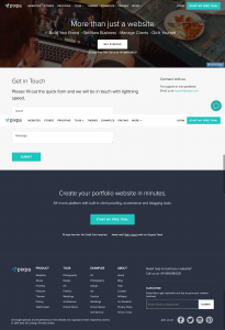
To be honest, it is a pretty simple contact us page. But what makes this page design work is the very first line that you see – the message that reinforces why the visitor is on their site in the first place and why they should be contacting Pixpa.
They also include their email address right next to the form, for all those who prefer reaching out to them directly instead of from their website.
2. Moz
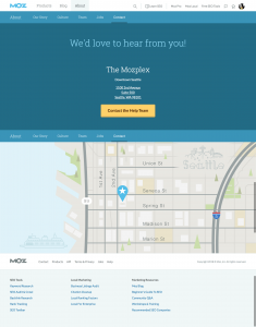
You might consider this an absolutely boring contact us page. But the strategy used here, is being conversion focused. Just as you land on the page, you see no other distractions – a straight up call to action and their address. The button here leads to the help forum, that further streamlines and quickens the process for a visitor looking for a solution or an answer.
3. Freshworks
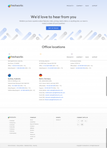
Following through the same design approach, as through the rest of the website, Freshworks too has a pretty simple contact page. Why it made it to our list of best contact us pages is because of how convenient it makes it for a visitor from different locations to reach them. Instead of beating about the bush, they have all their addresses, phone numbers and emails lined up clearly.
4. Zest.is
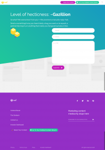
As a content curation site, you might think that Zest’s website is boring. But truth be told, they have one of the best contact us pages out there because they have invested as much effort in its design and copy to keep things interesting. Just look at the clear form they have on their page and the copy that would make you want to talk to the person who wrote it.
5. Neil Patel
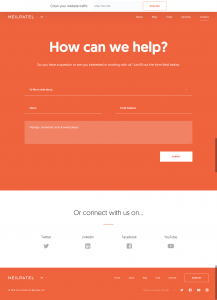
The conversion expert obviously has his contact us page nailed. What we like about this contact us page design is its subtle nudge to make a visitor interact with them. Starting right from offering help, to a quick drop down listing common categories of queries, the page is design makes it easier for a visitor to convert. It also links the visitor to all their social media pages, since they have increasingly become a channel of communication.
6. Hello Innovation
The approach of telling your visitor that you look forward to hearing from them, is simply brilliant. The header call to action that almost screams ‘Say Hello’ is hard to miss. Additionally, including important email address and phone number right below the headline, let’s the visitor get in touch with them right away.
But once a visitor does scroll down, they can see more contact information based on the type of query they have.

7. LegWork Studio
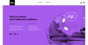
Who doesn’t like a web page that is designed well? Make your contact us page design even more interesting by adding an illustration that shows your personality or is reflected throughout the rest of the web pages. Apart from the clear contact information displayed on the page, we also love the handwritten testimonial they subtly included in the design.
8. CPB Group
If you have offices across the world, why not personalize your contact us page design for visitors from each of the locations? This is one of the best contact us pages we have seen because they understand the consumer psychology of wanting to connect with someone local, so well!

9. QED Group
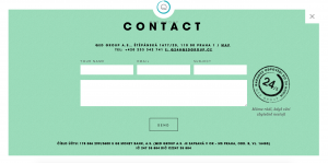
The best contact us pages have a design that makes it really easy for a visitor to get in touch with your business. Sometimes, that means to just share your contact information and a simple, quick contact form with your visitors. QED Group keeps it really simple and efficient, for instance.
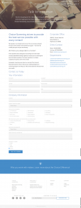
10. Choice Screening
The last one on our list of best contact us pages, is Choice Screening. While their contact page design may not look totally out of the world, their copy is what works the best for them. Their reinforcement of the fact that the visitor can reach out to them any time and get to actually speak to one of their team members, is like a reassurance that the visitor wouldn’t be put on hold endlessly or be talking to automated messages.
Optimizing your contact us page design
The best contact us pages can only inspire you to invest some of your time and resources into creating something that is absolutely unique to your business. For most, it is about creating something that they can quickly have up on their site, before starting their marketing and sales campaigns.
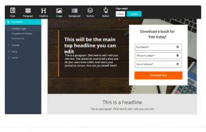
But it is still possible to keep your contact us pages optimized for maximum online lead generation. With smart tools like SalesPanda, you can actually create a conversion optimized landing page in minutes.
The drag and drop editor makes it easy for you to add/subtract elements you may want to keep on the page. You can customize your contact us page design to match your brand easily, and at the same time, include a nifty form right there for a visitor to reach you through.
But in general, here are a few things you would want to keep in mind to make it to the next best contact us pages list:
-> Keep your contact information clearly visible (email ids and phone numbers)
-> Include an optimized form for quick interaction
-> Encourage interaction with an interesting copy
-> Include links to your social profiles
-> Tell your story if possible
-> Show a glimpse of your team
-> Optimize your contact us page for all devices (desktop and mobile)

